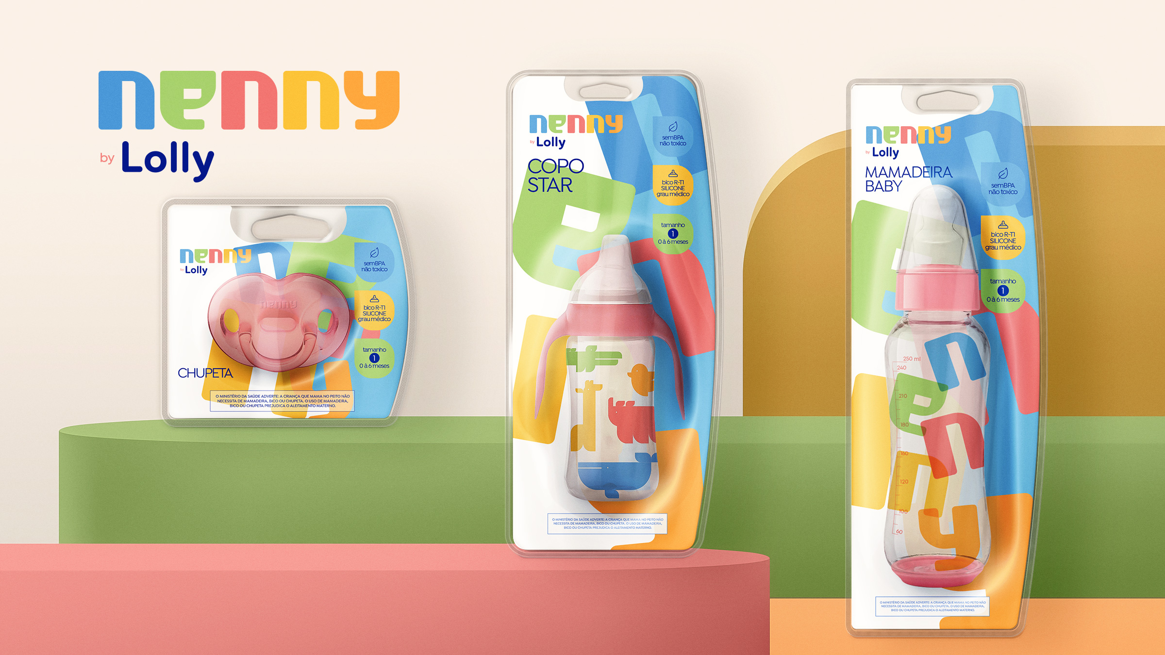
en
About the Project
Lolly is a company dedicated to the health and well-being of mothers and babies, offering a complete line of products such as bottles, toys, and accessories. With over 30 years in the market, Lolly is already well established but needed a portfolio update to adapt to the demands of new markets and maintain its relevance in the industry.
The Challenge
The challenge was to reposition the brand and segment its portfolio into three distinct sub-brands, each with its own visual identity and target audience. This strategic realignment allowed Lolly to diversify its products, become more competitive, and expand its market share adapting to new consumer trends and strengthening its presence in the market.
pt
Sobre o Projeto
A Lolly é uma empresa dedicada à saúde e ao bem-estar de mães e bebês, oferecendo uma linha completa de produtos como mamadeiras, brinquedos e acessórios. Com mais de 30 anos de atuação no mercado, a Lolly já é uma marca consolidada, mas precisava atualizar seu portfólio para atender às demandas de novos mercados e manter sua relevância no setor.
O Desafio
Reposicionar a marca e organizar o portfólio em três sub-marcas distintas, cada uma com identidade visual e público-alvo próprios. Esse realinhamento estratégico permitiu à Lolly diversificar sua oferta de produtos, tornar-se mais competitiva e ampliar sua participação de mercado, acompanhando novas tendências de consumo e fortalecendo sua presença no mercado.
en
About the Project
Nenny, a product line under Lolly, focuses on offering the best value for mothers and babies. With a playful and colorful visual language, this line aims to attract an audience that values quality without giving up accessibility.
The Challenge
As the line facing the highest market competition, it was essential for Nenny to stand out in a bold yet objective way. The developed strategy created a visual identity that is both playful and approachable. We designed a custom typeface inspired by simple geometric shapes and a vibrant palette of primary colors.
For the packaging, we adopted a practical approach, clearly grouping the product benefits and creating icons that make features easy to understand. The result is a fun and visually cohesive product line that conveys both functionality and the brand’s joyful energy.
pt
Sobre o Projeto
Nenny é uma linha de produtos da Lolly focada em oferecer o melhor custo-benefício para mães e bebês. Com uma linguagem visual lúdica e colorida, a linha busca atrair um público que valoriza qualidade sem abrir mão da acessibilidade.
O Desafio
Por ser a linha que enfrenta maior concorrência no mercado, era essencial que a Nenny se destacasse de forma ousada, mas objetiva. A estratégia desenvolvida resultou em uma identidade visual divertida e próxima do consumidor. Criamos uma tipografia exclusiva, inspirada em formas geométricas simples, e uma paleta vibrante de cores primárias.
Para as embalagens, adotamos uma abordagem prática, organizando de forma clara os benefícios dos produtos e criando ícones que facilitam a compreensão das funcionalidades. O resultado é uma linha divertida e visualmente coesa, que comunica funcionalidade e a energia alegre da marca.
en
About the Project
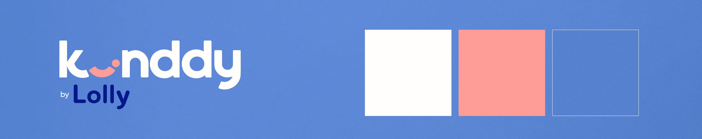
Kinddy, a product line by Lolly, is designed for parents who value technology and seek products with greater durability and ease of use. With a focus on innovation and quality, the line needed to convey credibility and trust, appealing to a more demanding and discerning audience.
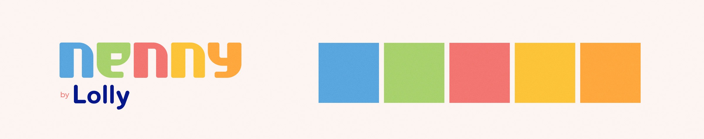
The Challenge
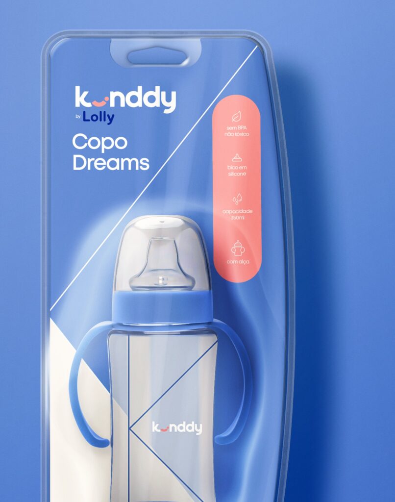
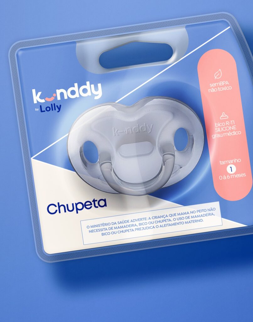
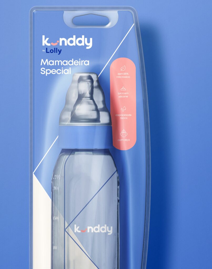
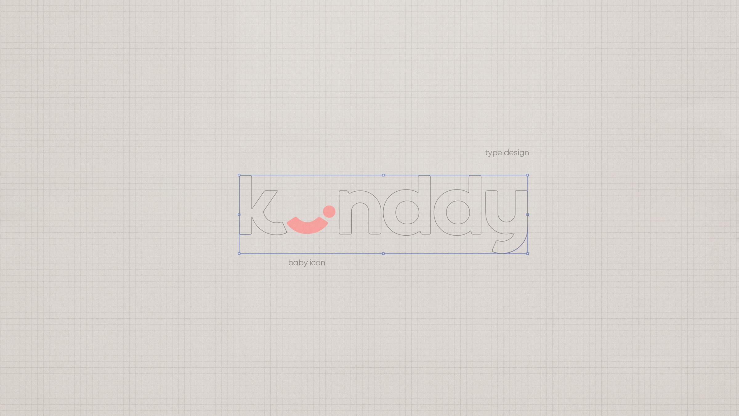
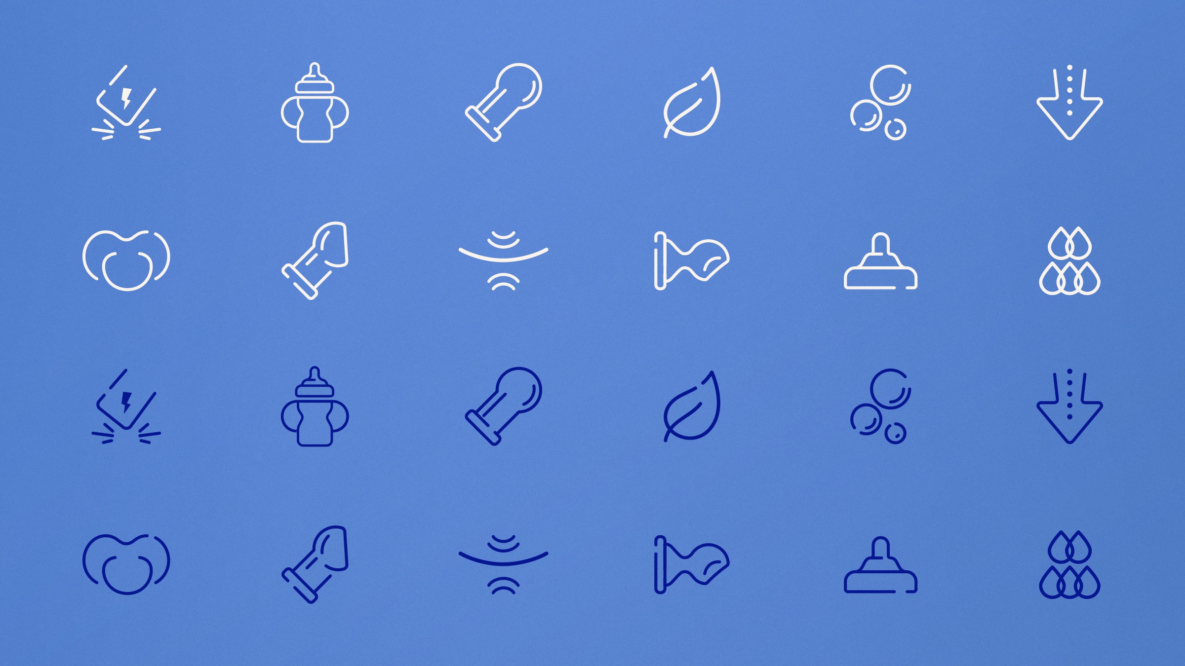
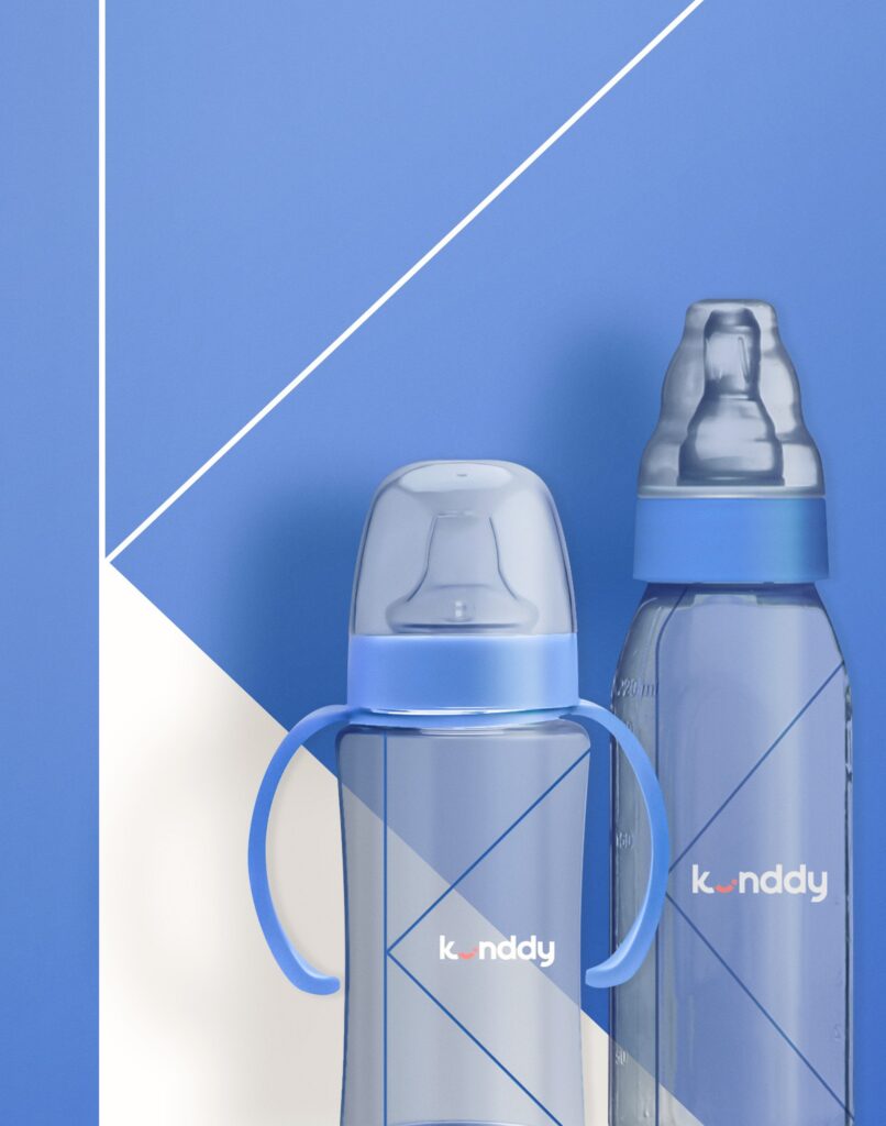
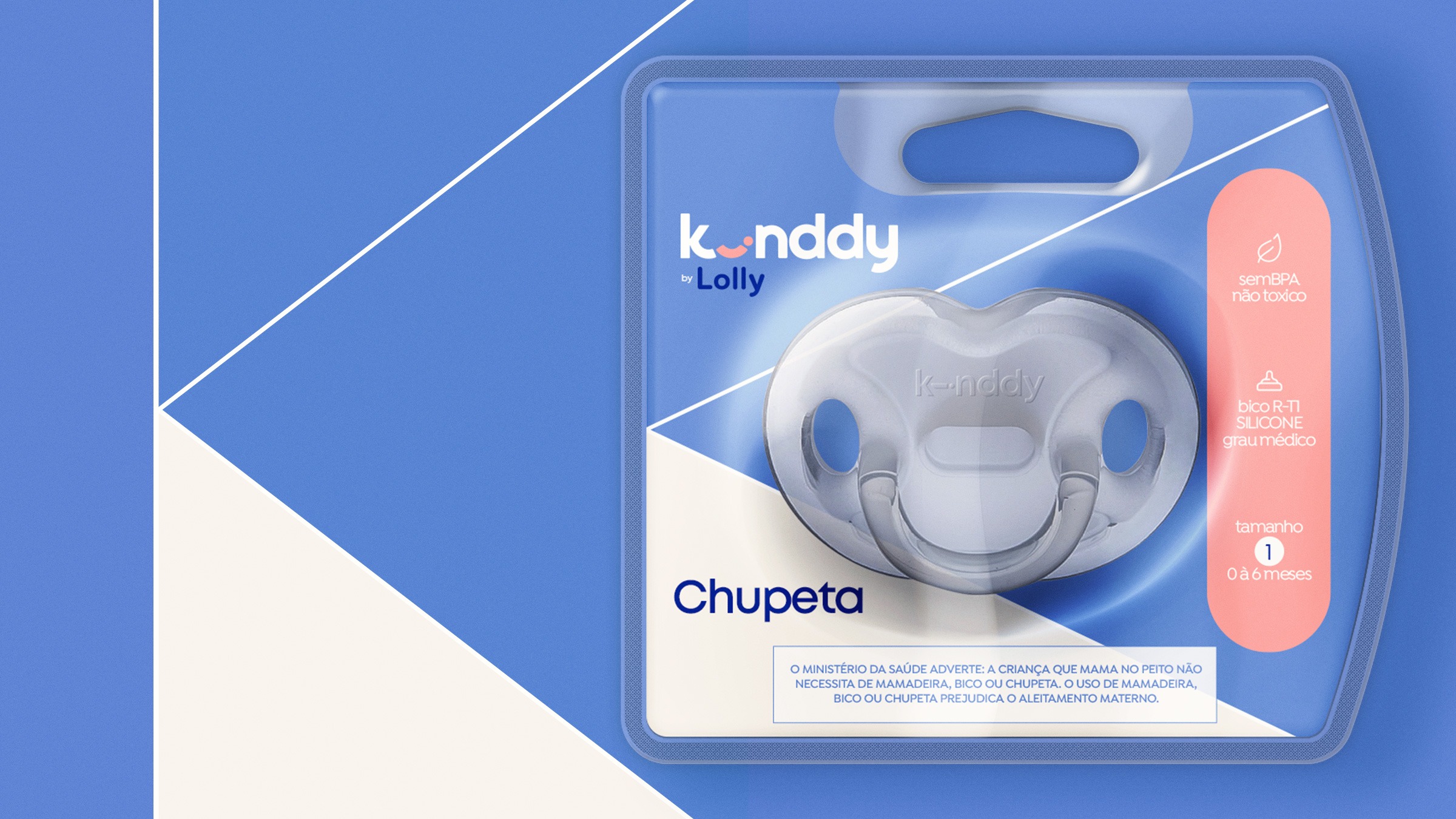
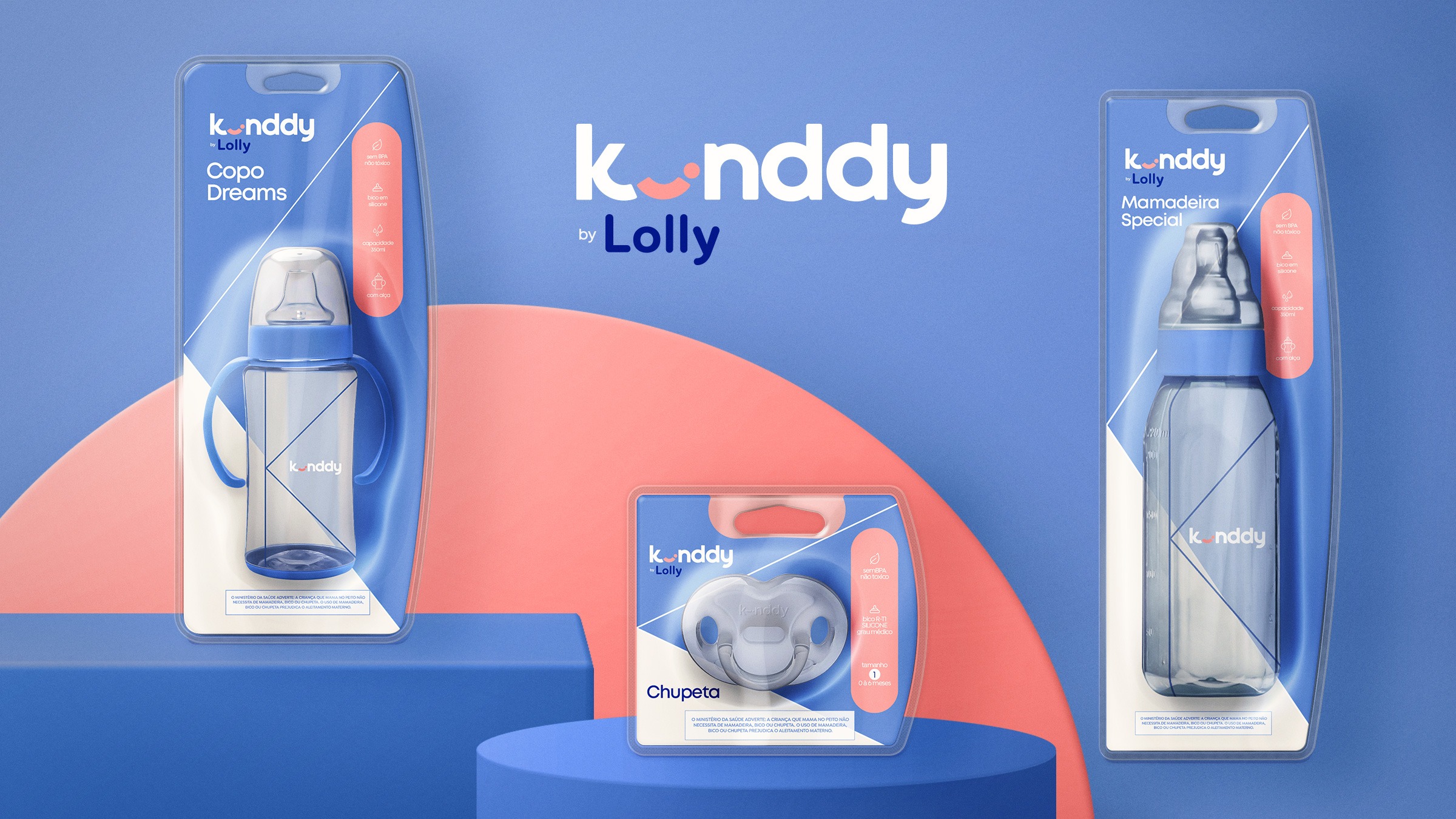
For the visual concept, we adopted a minimalist and sophisticated aesthetic inspired by leading international brands. The color palette was intentionally limited to two contrasting tones, creating visual harmony that enhances the sense of refinement. The logo conveys care and serenity, featuring a graphic depiction of a sleeping baby within the letter “I.”
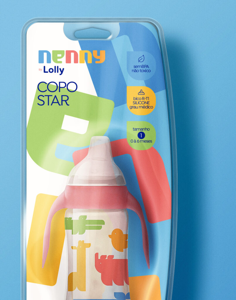
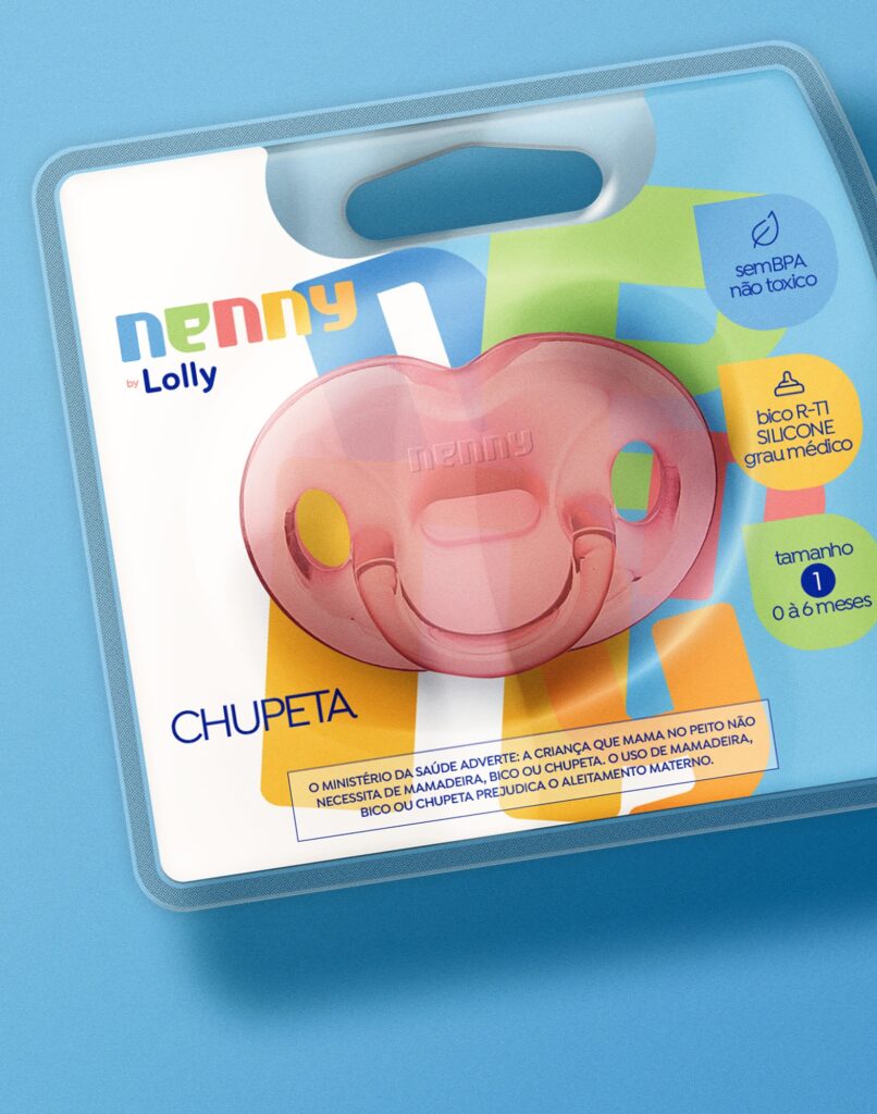
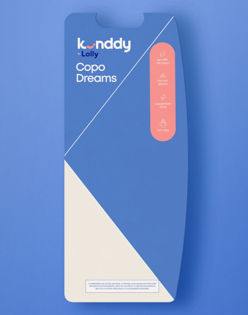
For the packaging, the “K” was used as a central graphic element, creating three spaces that help organize information clearly and ensure simplicity, while reinforcing the line’s branding. The result positioned Lolly in a new market segment, with products able to compete directly with international brands, projecting both confidence and innovation.
pt
Sobre o Projeto
Kinddy é uma linha de produtos da Lolly desenvolvida para pais que valorizam tecnologia e buscam produtos com maior durabilidade e facilidade de uso. Com foco em inovação e qualidade, a linha precisava transmitir credibilidade e confiança, dialogando com um público mais exigente e criterioso.
O Desafio
Para o conceito visual, adotamos uma estética minimalista e sofisticada, inspirada em grandes marcas internacionais. A paleta de cores foi intencionalmente reduzida a dois tons contrastantes, criando harmonia visual e reforçando a sensação de sofisticação. O logotipo transmite cuidado e serenidade, trazendo a representação gráfica de um bebê dormindo dentro da letra “I”.
Nas embalagens, a letra “K” foi utilizada como elemento gráfico central, criando três áreas que organizam as informações de forma clara e objetiva, garantindo simplicidade e fortalecendo a identidade da linha. O resultado posicionou a Lolly em um novo segmento de mercado, com produtos capazes de competir diretamente com marcas internacionais, comunicando confiança e inovação.
en
About the Project
The Tarssy line is dedicated to mothers, offering products focused on maternal care and everyday convenience. With a proposal that values comfort, it is ideal for modern mothers seeking practicality without giving up aesthetics.
The Challenge
Inspired by the renowned artist Tarsila do Amaral born in the same city where the company is based the visual identity and logo of the Tarssy line revolve around her artwork. The illustrations capture the essence of her creations. The design of this line combines sophistication, functionality, and technology, along with the collaboration with the artist, which brings art to both the product and the brand.
The result is a line that not only meets mothers’ needs but also enhances the aesthetic and user experience, strengthening the emotional connection with the brand.
pt
Sobre o Projeto
A linha Tarssy é dedicada às mães, oferecendo produtos voltados ao cuidado materno e à praticidade do dia a dia. Com uma proposta que valoriza o conforto, é ideal para mães modernas que buscam funcionalidade sem abrir mão da estética.
O Desafio
Inspirada na obra da consagrada artista Tarsila do Amaral, nascida na mesma cidade onde a empresa está sediada, a identidade visual e o logotipo da linha Tarssy orbitam em torno de sua linguagem artística. As ilustrações capturam a essência de suas criações. O design da linha combina sofisticação, funcionalidade e tecnologia, somados à colaboração com a artista, que leva a arte para o produto e para a marca.
O resultado é uma linha que não apenas atende às necessidades das mães, mas também eleva a experiência estética e de uso, fortalecendo a conexão emocional com a marca.