Sobre o Projeto
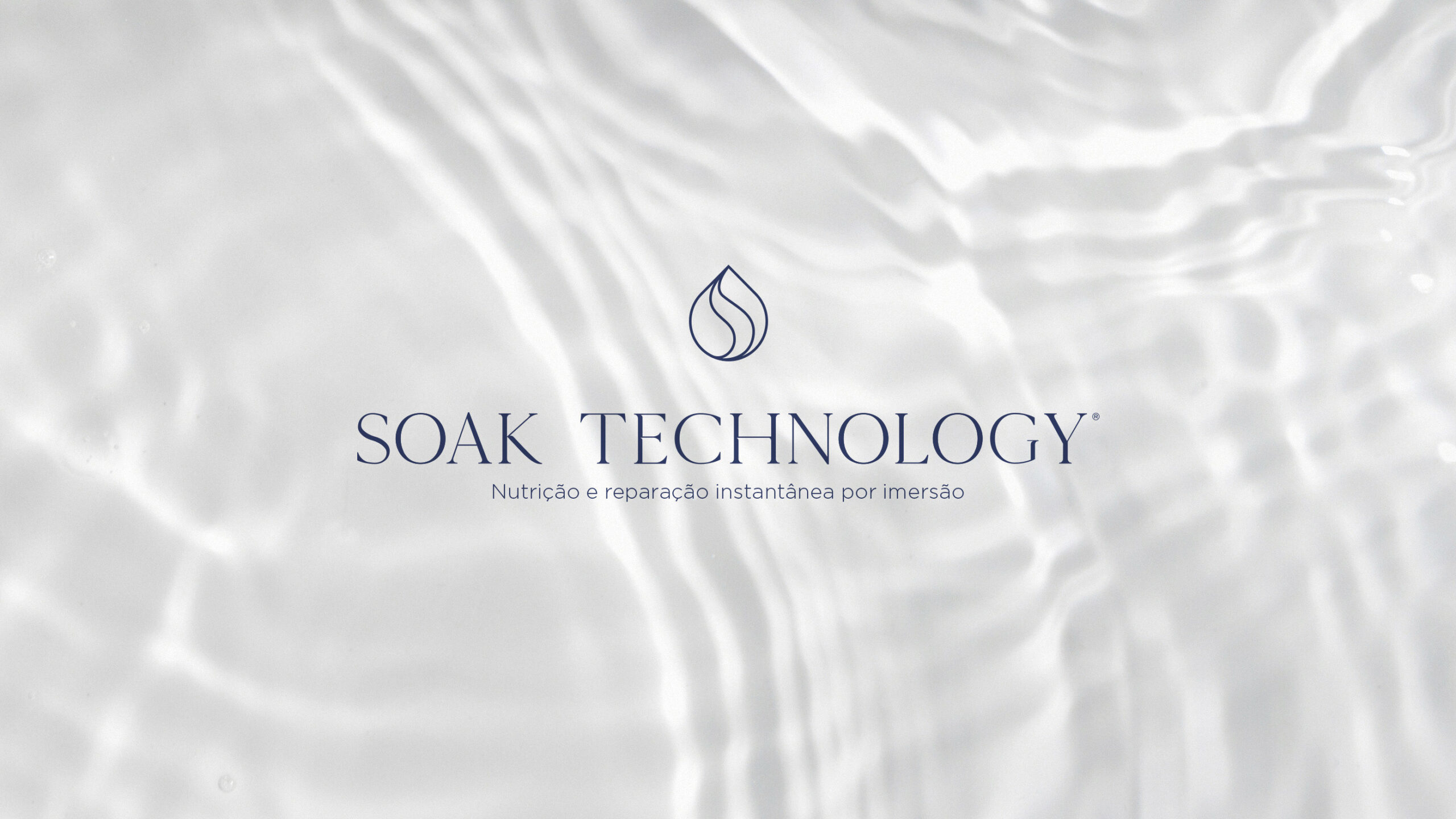
A Ince nasce das mãos de Doni, proprietário de um renomado salão de beleza, após sua descoberta de que é possível proporcionar resultados de hidratação superiores aos cabelos por meio de um processo de imersão.
O Desafio
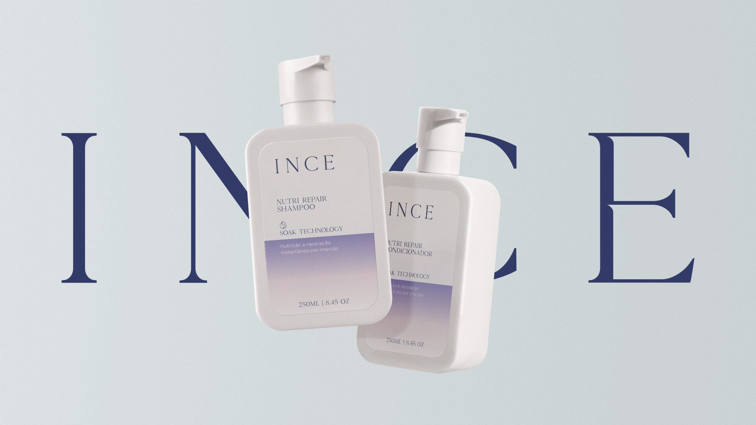
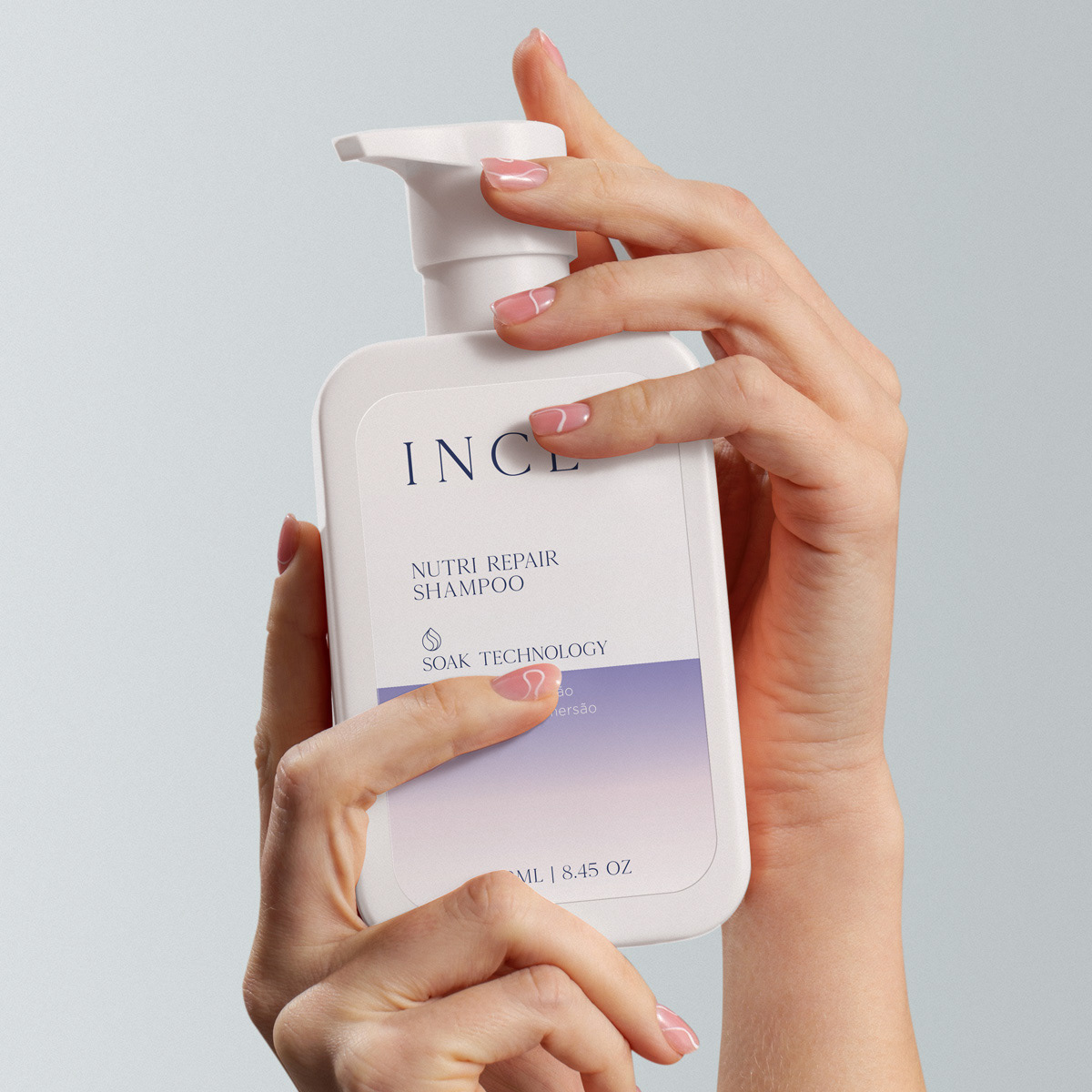
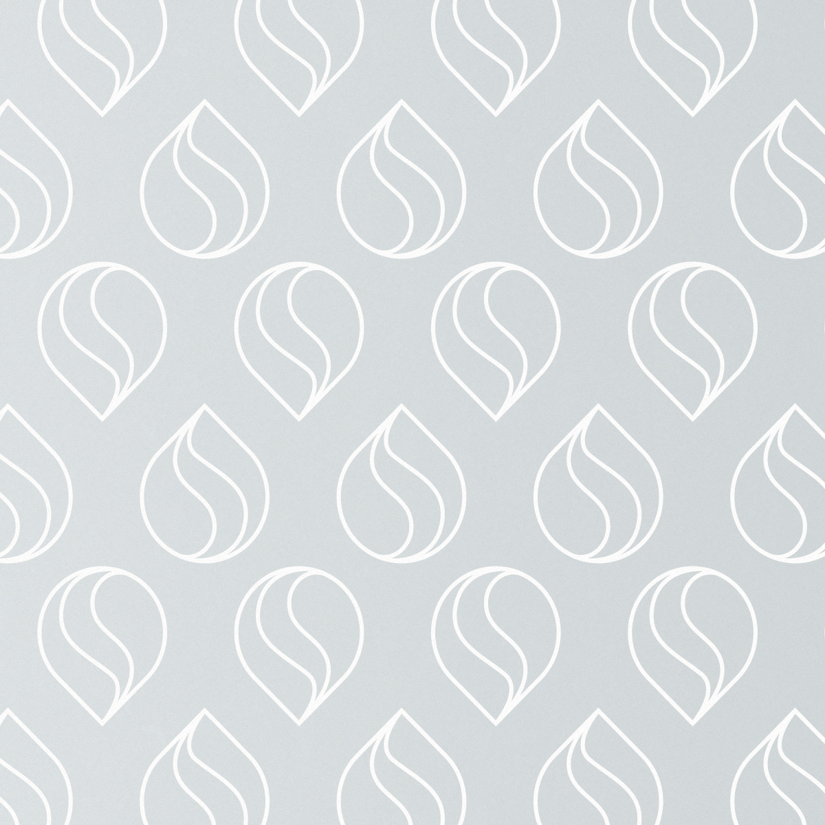
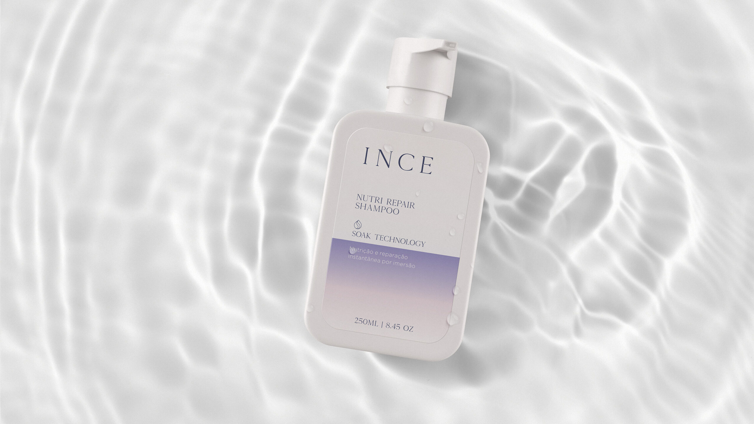
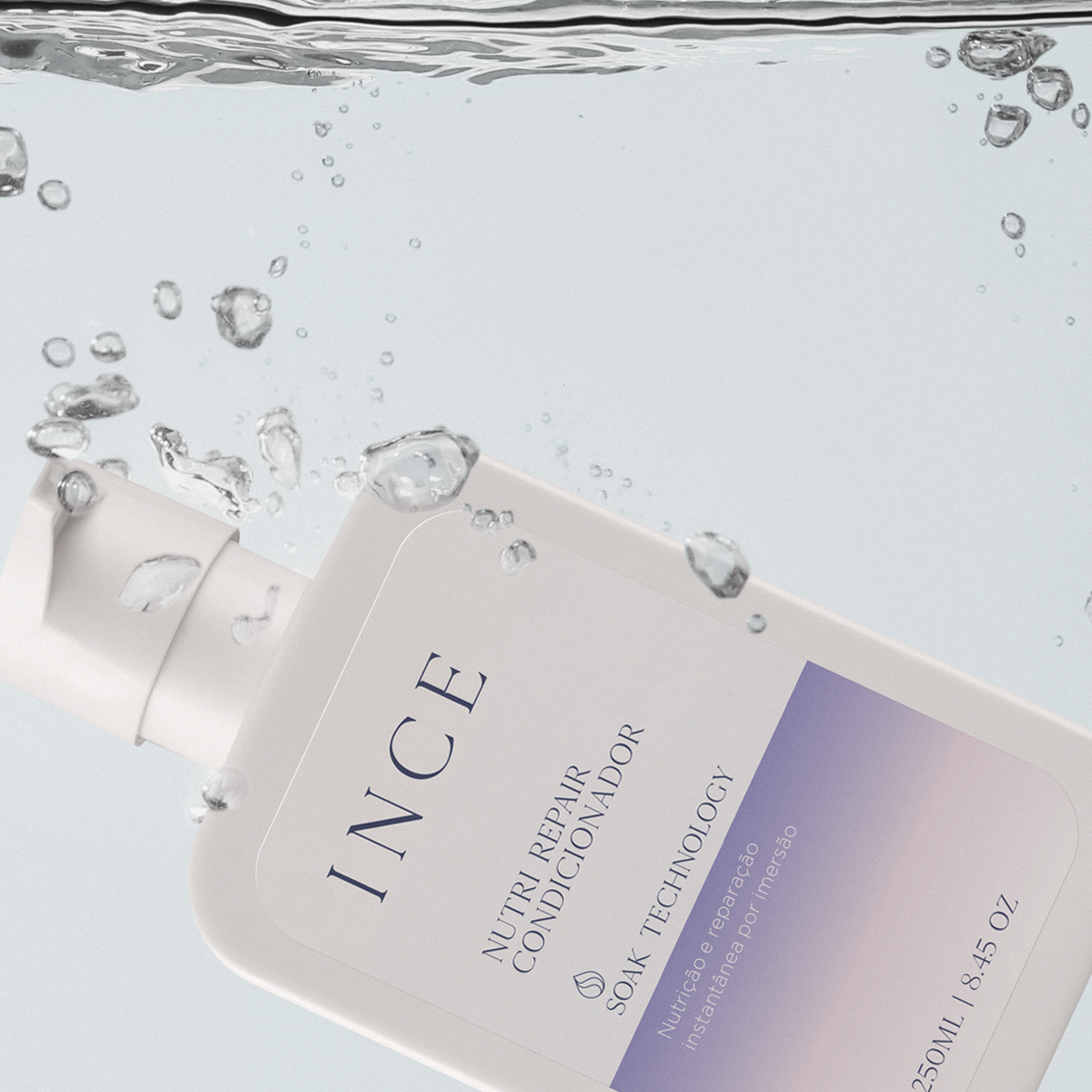
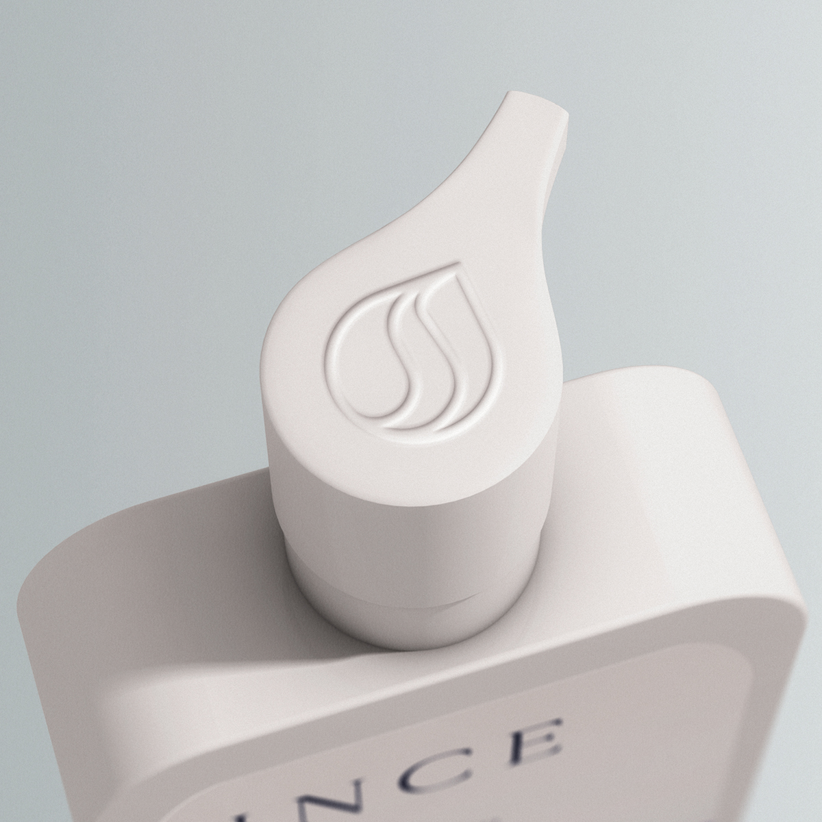
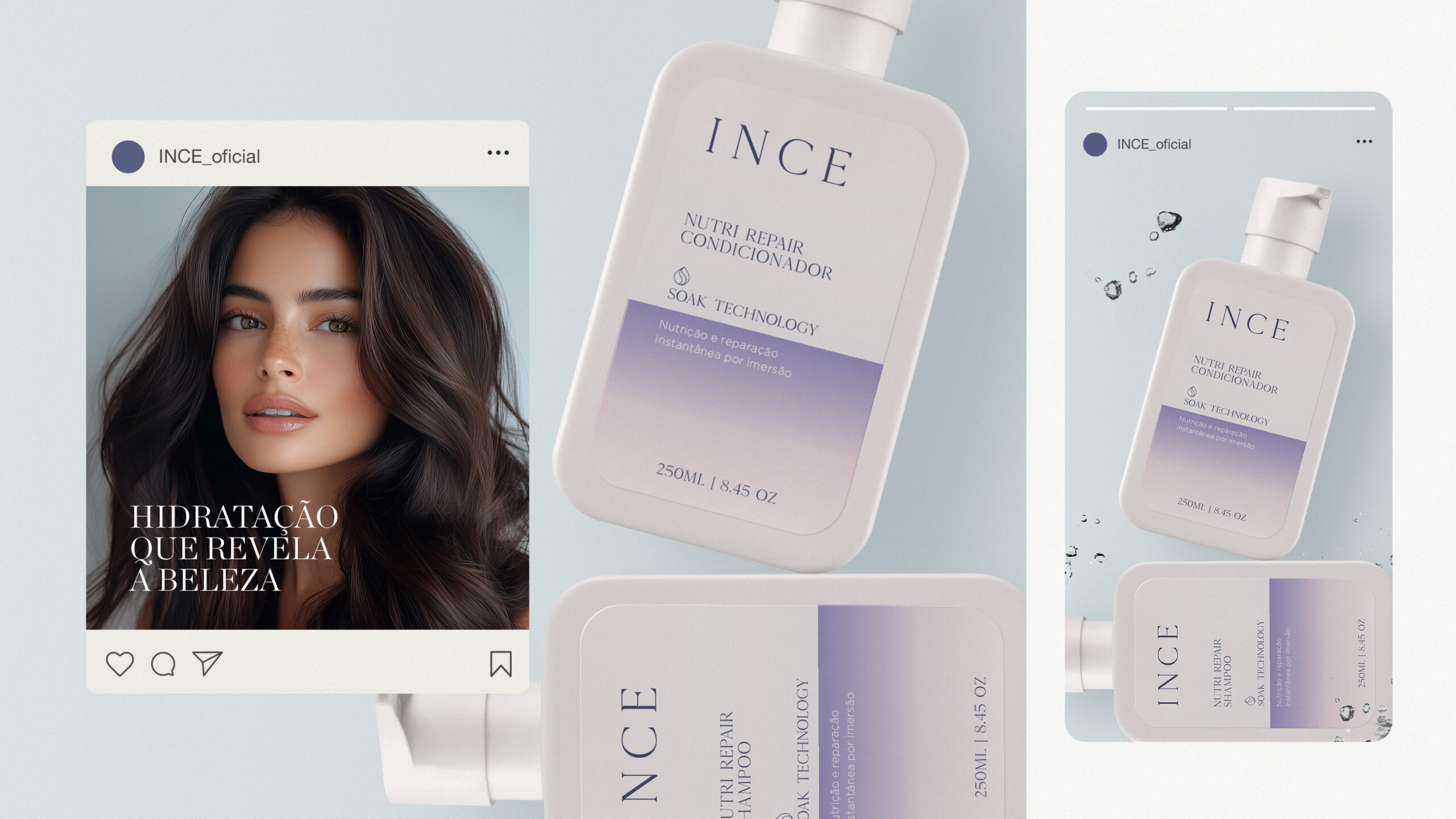
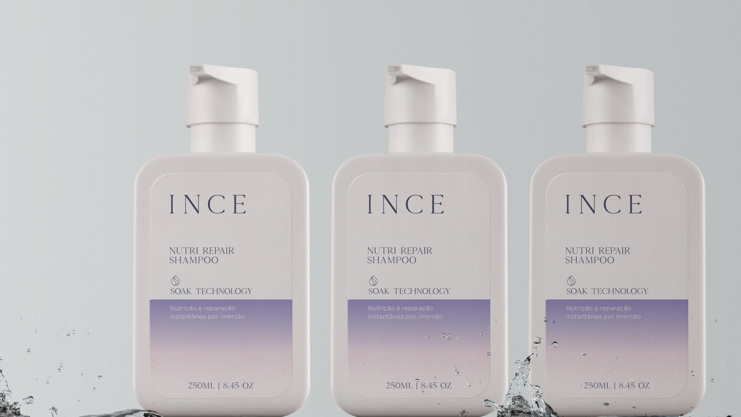
O design inovador das embalagens tem um propósito claro: capturar a essência desse processo de imersão. O ícone representativo combina uma mecha de cabelo envolvida por uma gota com a letra “S” inicial do nome, que batiza a tecnologia “Soak Technology”, ideia central da marca.
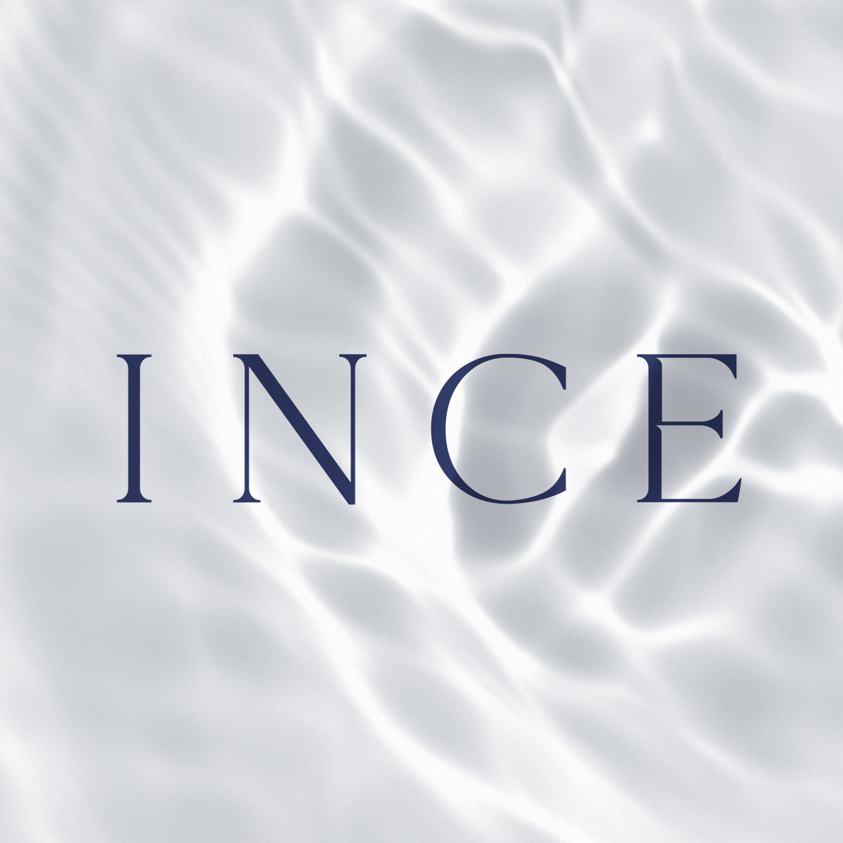
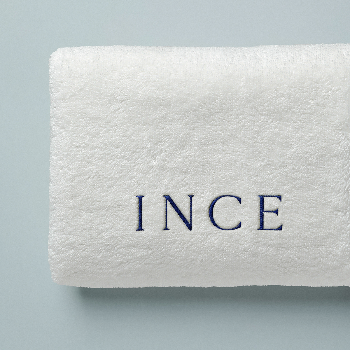
Além disso, a escolha de cores para as embalagens e sua aplicação, que preenche apenas metade do frasco, não só cativa visualmente, mas também remete à sensação de imersão e sofisticação. A tipografia da marca recebeu um tratamento especial para comunicar glamour e sofisticação, mantendo, ao mesmo tempo, um estilo minimalista.